

Bupa
Project
Website transformation concept development for user testing
Agency
Bound Interactive
Deliverables
- Customer research
- Design discovery
- UX strategy
- UX design
- Concept development
- Prototype
Bupa is going through a massive transformation phase with focus on digital asset and tech transformation. This is both exciting and needed for the business to reach its goal of becoming more customer centric.
The ask
By digging into existing research, user journeys, insights, known pain points, drivers, and business objectives we were able to identify gaps and develop a customer research approach centred around moderated user testing.
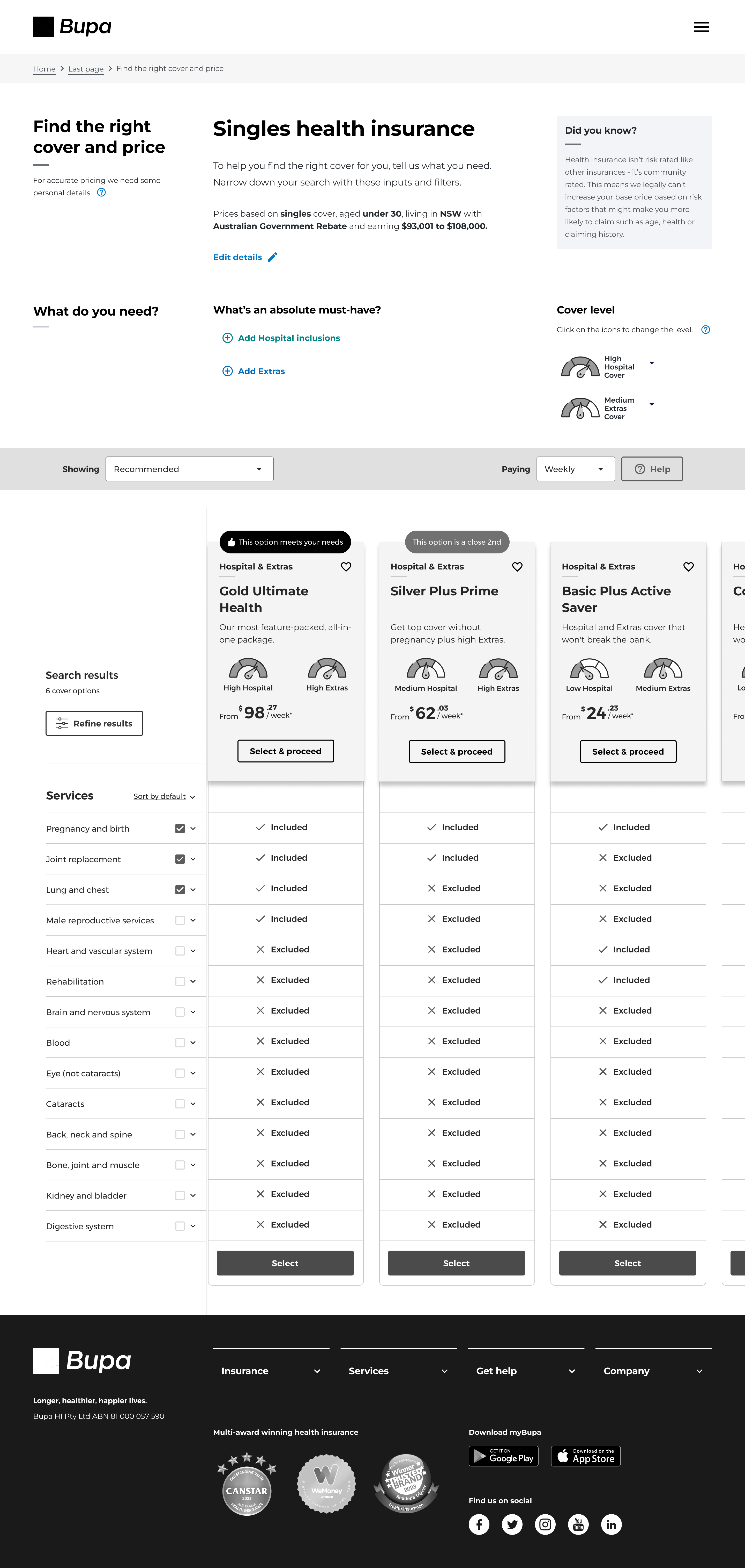
This brief was fairly open with the objective of casting a wide net to pull in more customer insights and bridge some gaps in knowledge on customer behaviours and motivators. The focus is on the ‘upper funnel’ or landing and informational pages prior to the health insurance product comparison stage.
Background
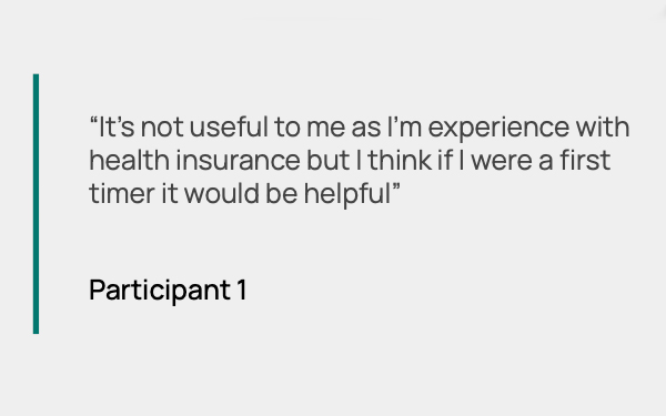
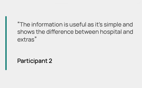
Health insurance is a complicated B2C product. We know from Bupa’s members and prospects that they’re often confused about what they need in cover, what they’re choosing and the differences in the types of cover (although they often think they understand it) and can feel indecisive because of that.
We also know the user journey is not a straightforward one. It often involves many site visits between Bupa and competitors, where prospects may even resort to making their own lists or spreadsheets to narrow their cover options down.
Approach
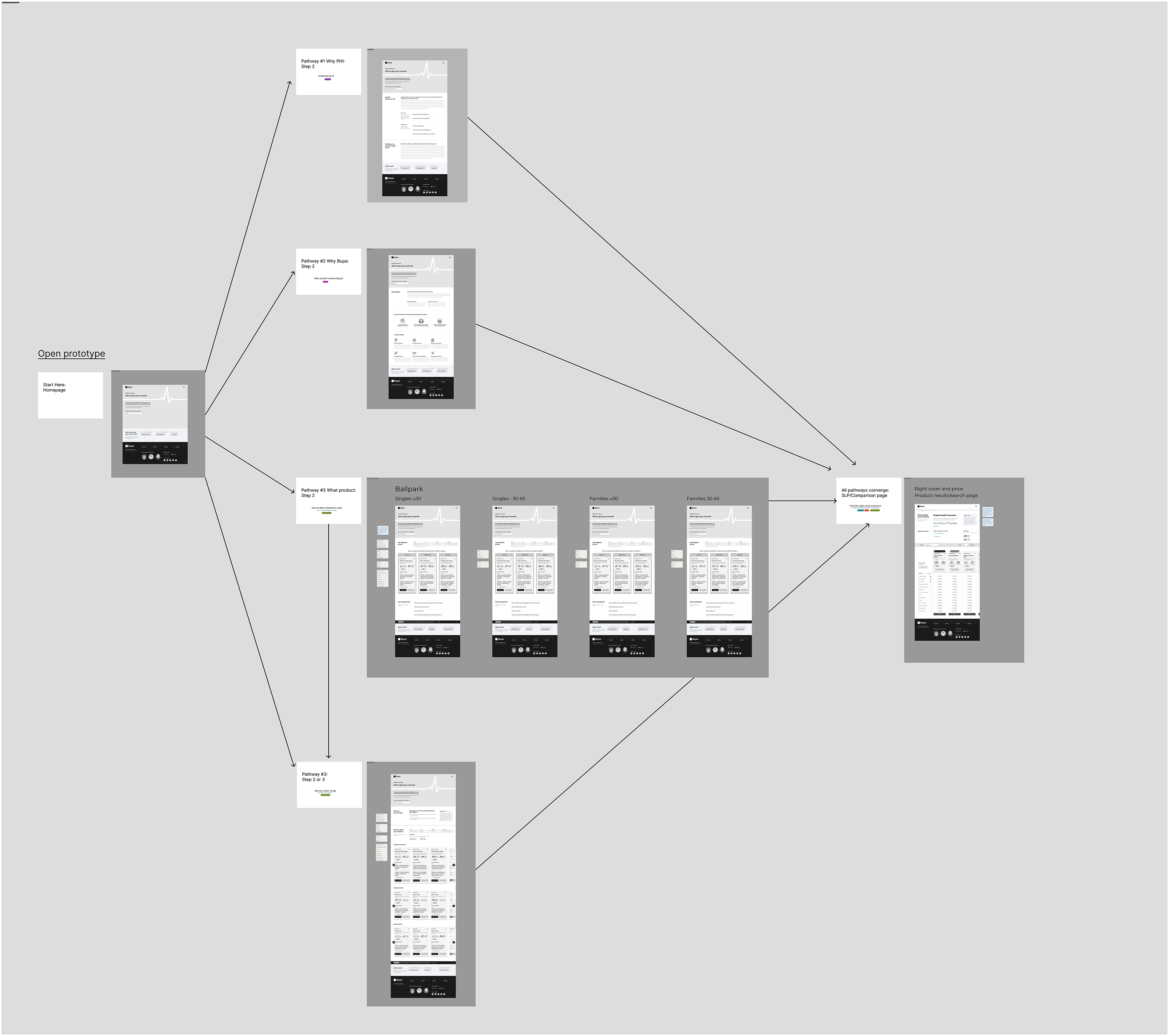
To gain more insights there were 2 different approaches tested. I strategised and designed this low-fi concept (Concept 1), and another designer developed the second concept that was tested.
Concept 1 was centered around the hypothesis:
If we serve the customer with the information they’re seeking ‘in this moment’ catered to the point of the purchase journey they’re in today, we’ll drastically reduce friction and cognitive load by reducing unnecessary noise and allowing customers to easily find what they need today.
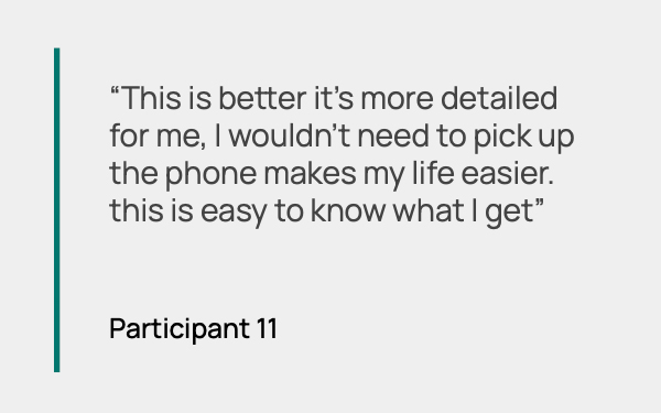
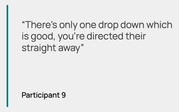
I designed Concept 1 to be a dynamic homepage that focuses on 1 central navigation spot that simply asks the user what they’d like to do. Upon input, the information they seek is loaded on the homepage.
Outcome
Concept 1 was a clear winner, as the cognitive load reduction and obvious navigation entry was ‘easy’ for customers to know where to go first, without needing to search around. It was found to be intuitive.
Concept 2 in comparison was centred around a ‘flight search’ on homepage type product finder. It was revealed that it was too soon in the journey to feature on the homepage, and was complex in nature with many filtering options, though they were intuitive.
Both concepts provided valuable insights, which fed into my Round 2 concept.
Journeys
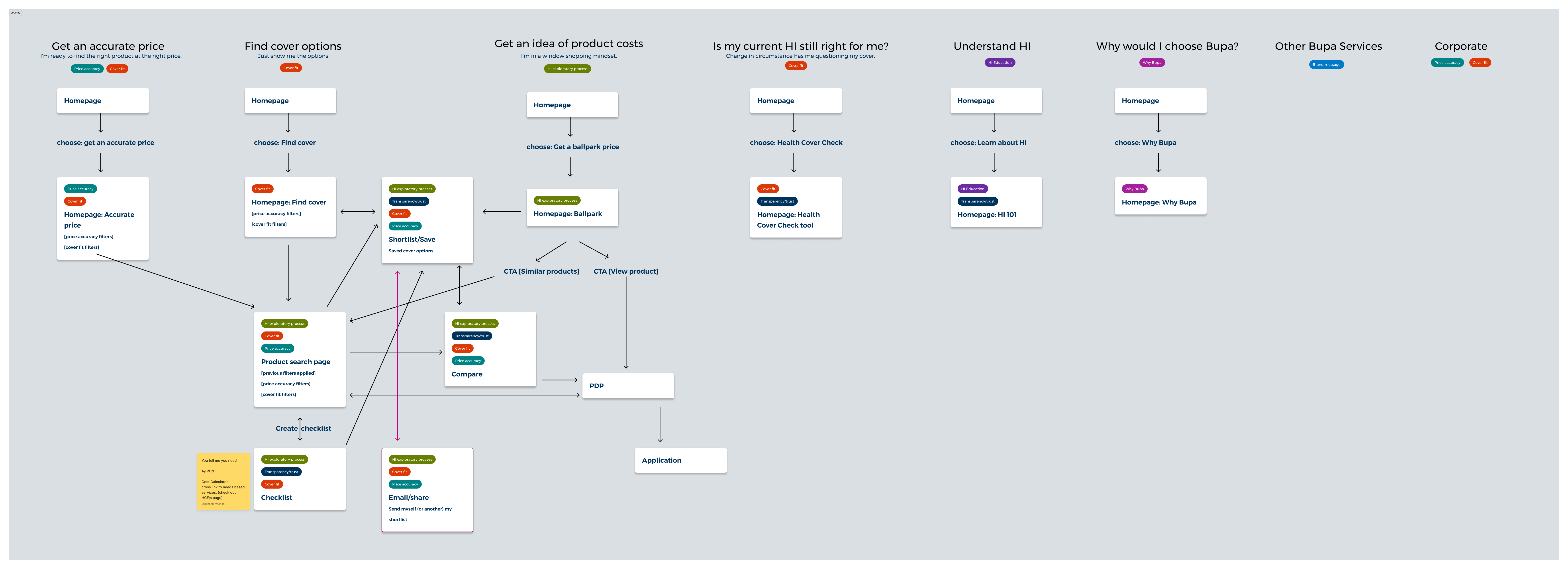
Prototype
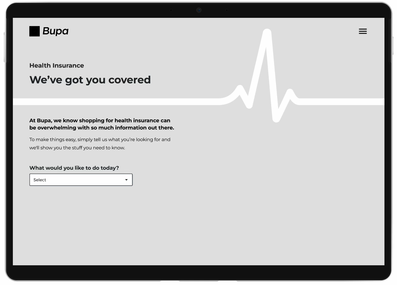
Dynamic homepage
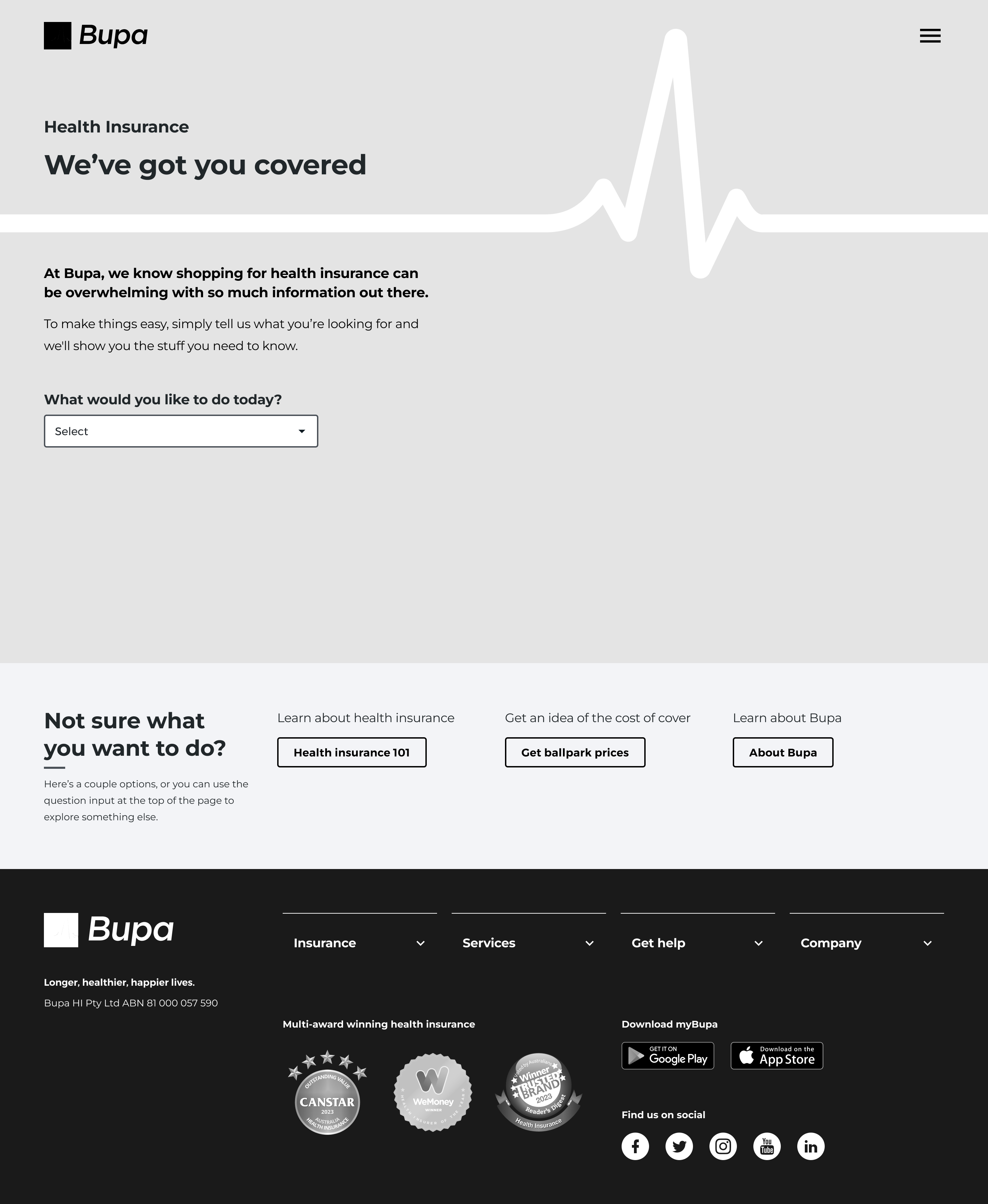
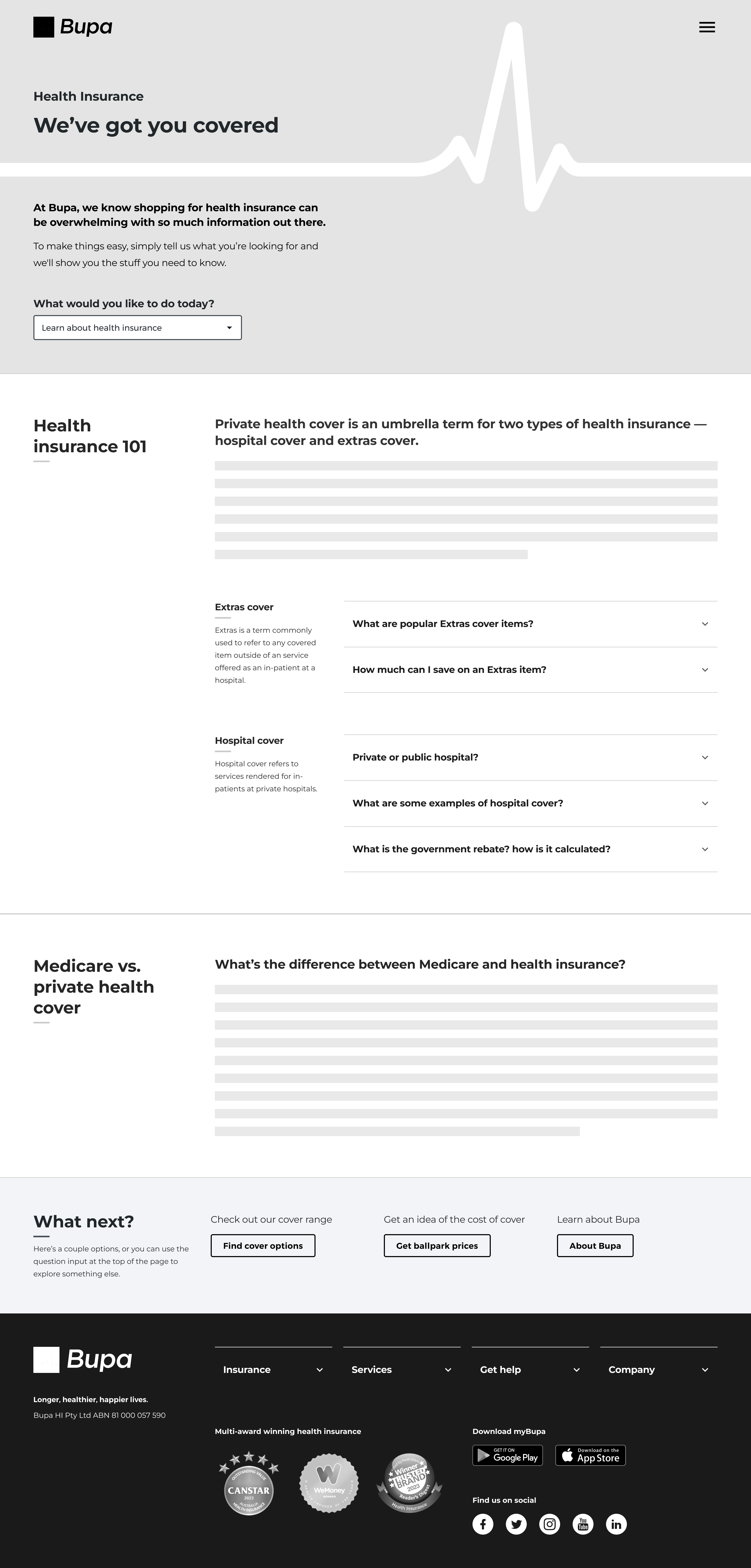
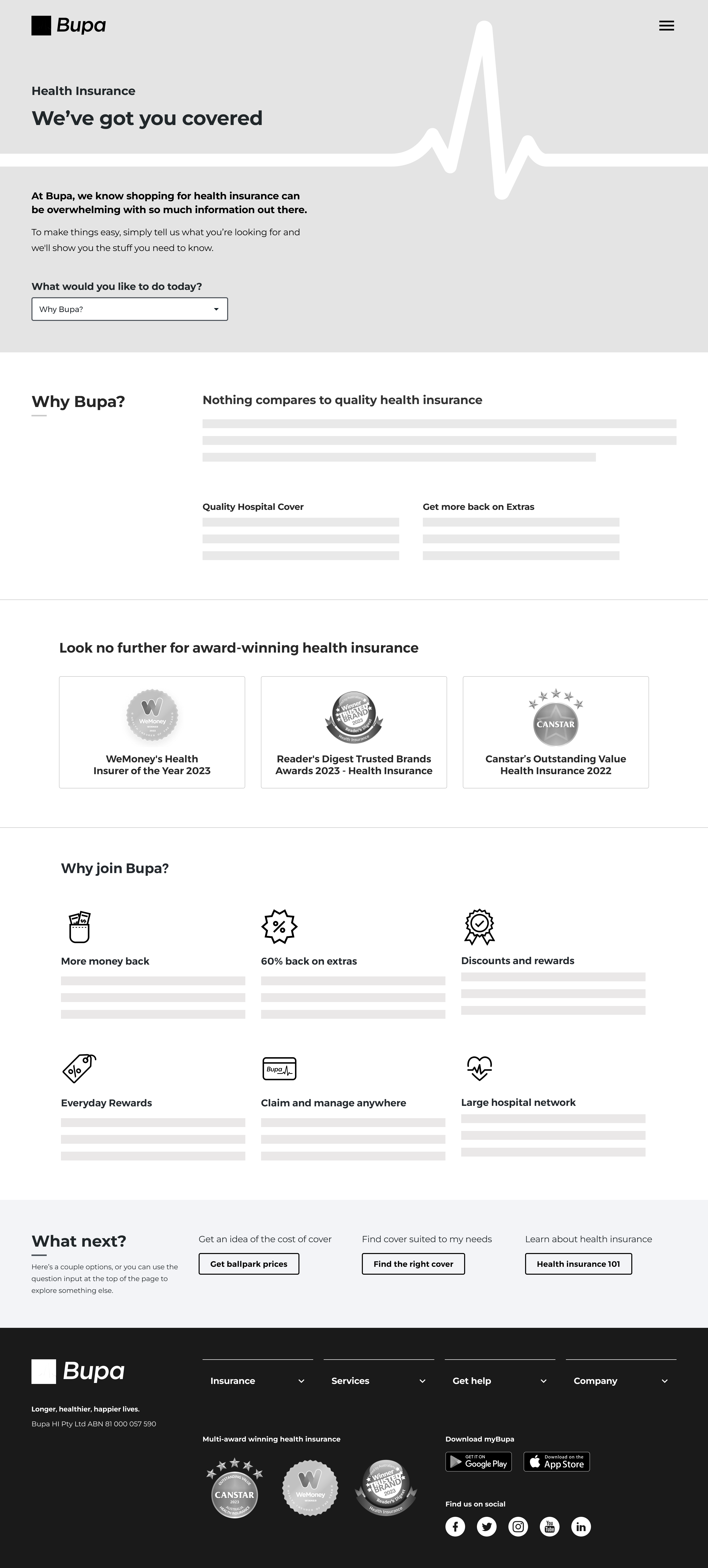
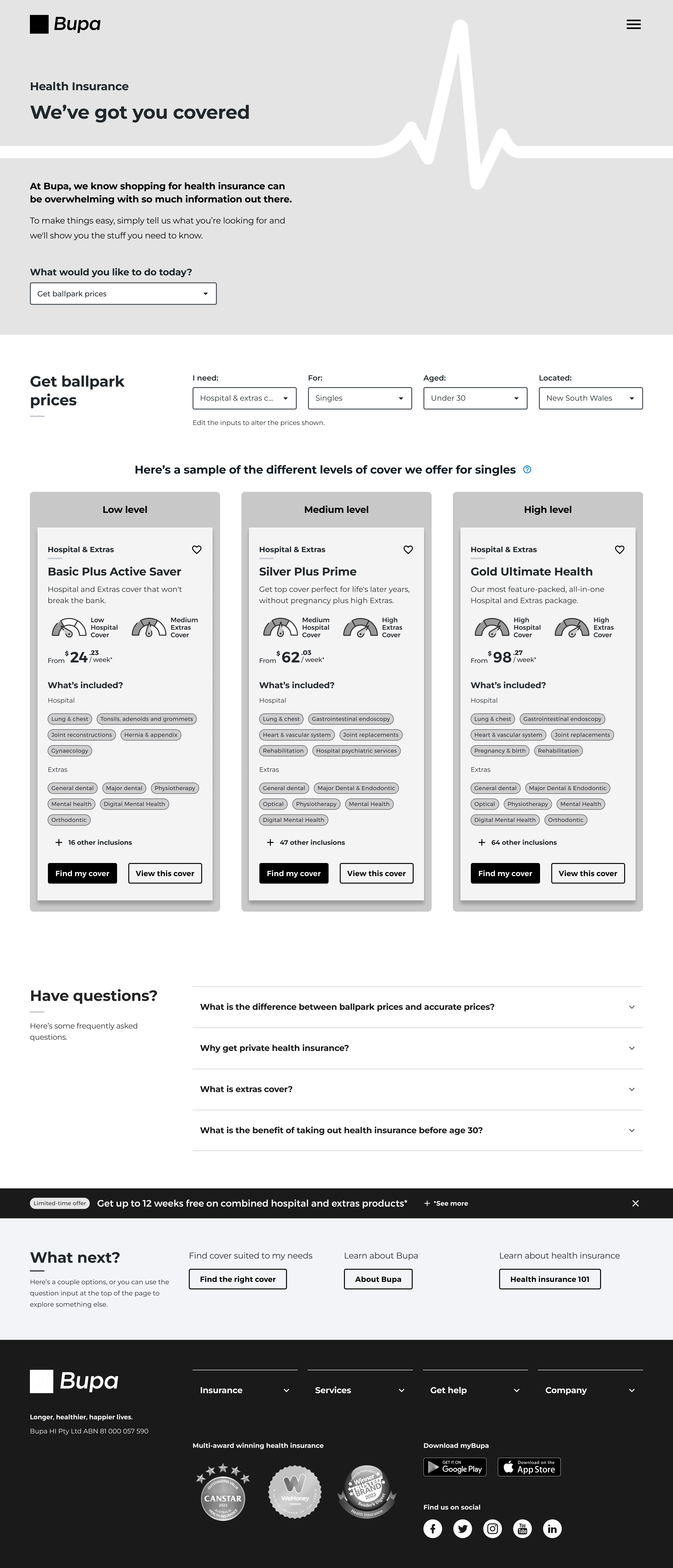
Concept 1
Concept 1 – insights
Concept 2
Concept 2 – insights