

Fintech
eComm
New pages
Navigation design
Sole designer
Client
Smart Group
Project
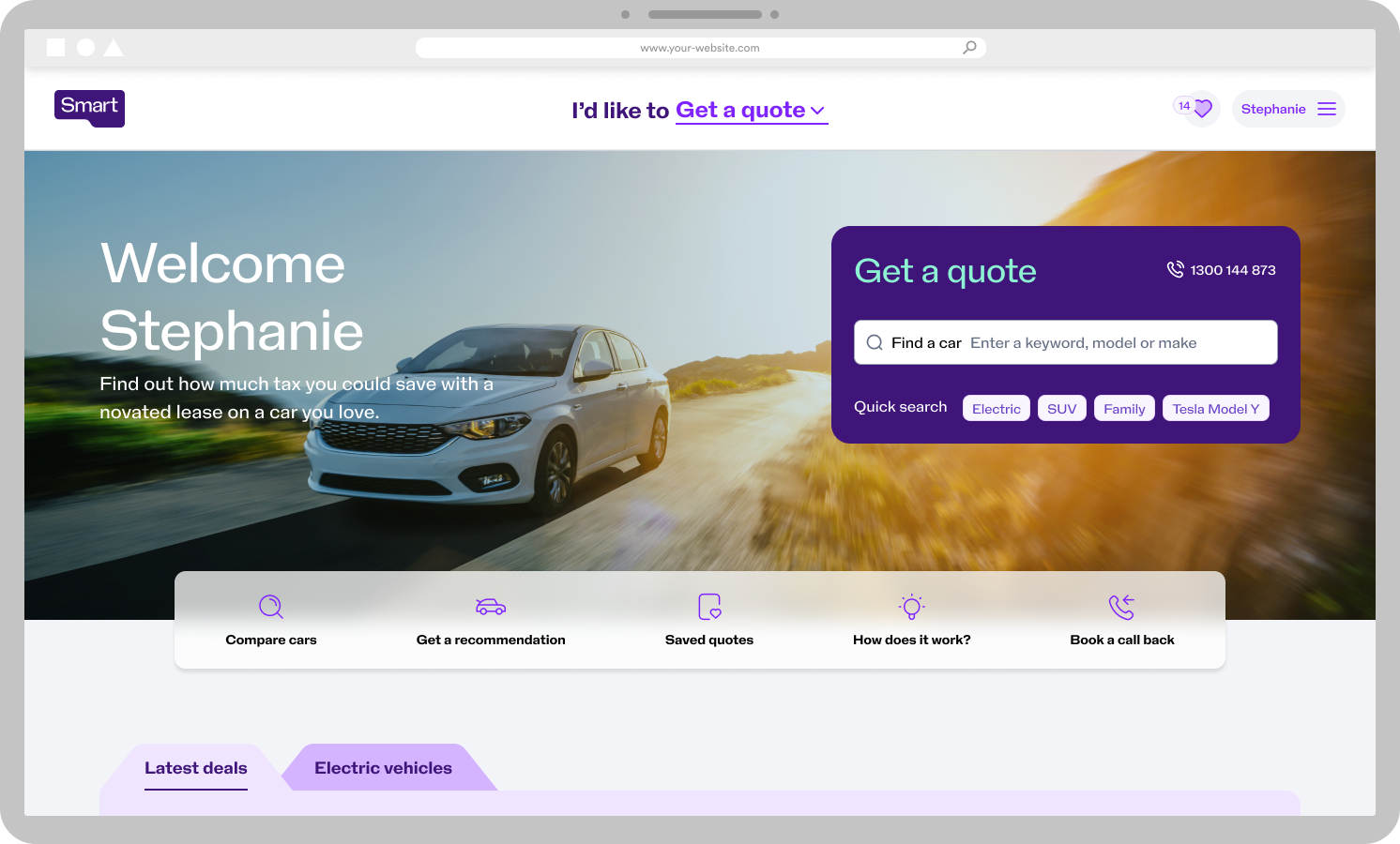
New customer journeys and navigation
Deliverables
- Customer research
- Design discovery
- UX strategy
- Journey mapping
- UX design
- Concept development
- Prototype
- UI design
- Dev handover
- Showcases
- Stakeholder management
Through a major digital, tech and brand transformation raises many problems to anticipate and preempt.
The ask
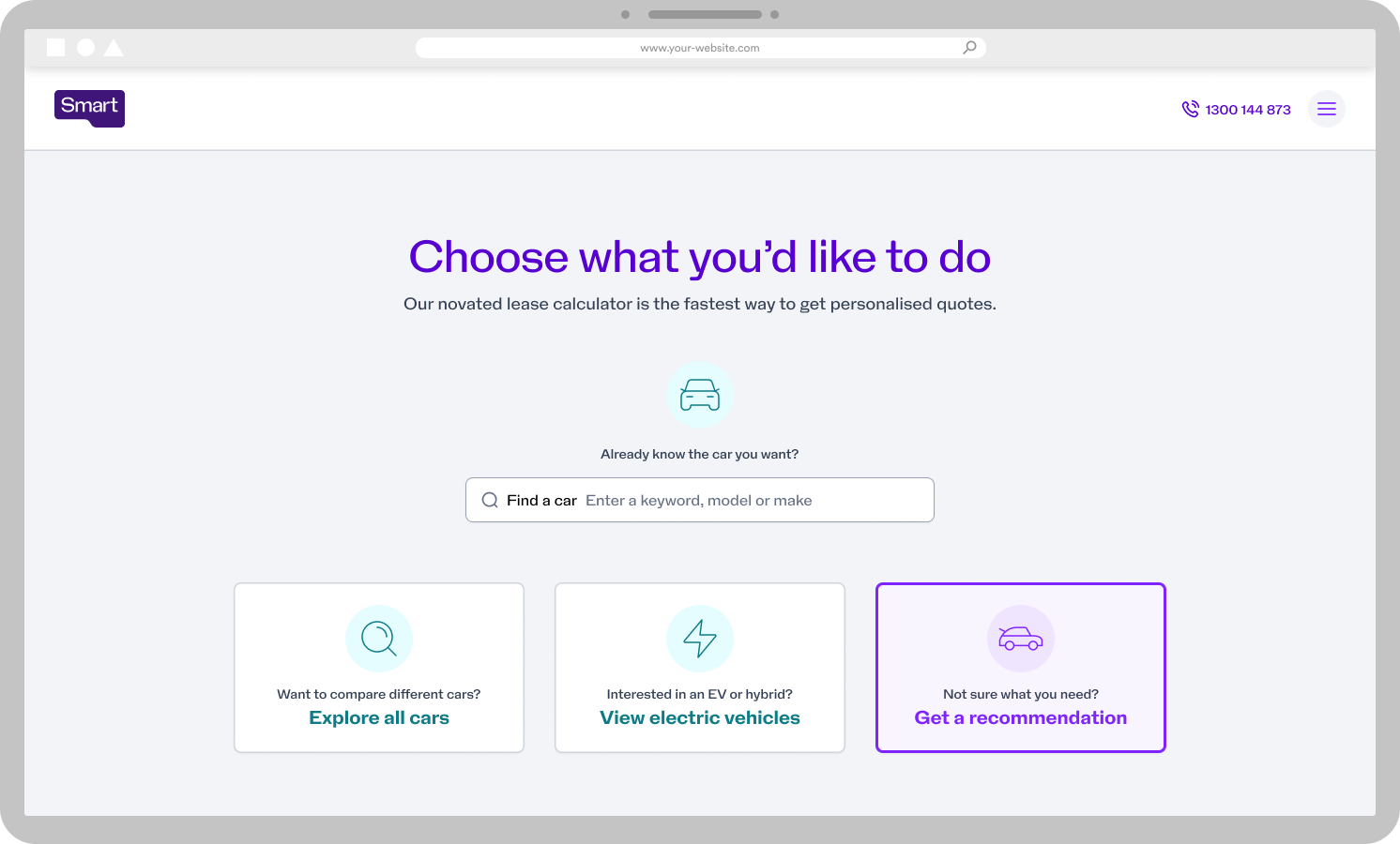
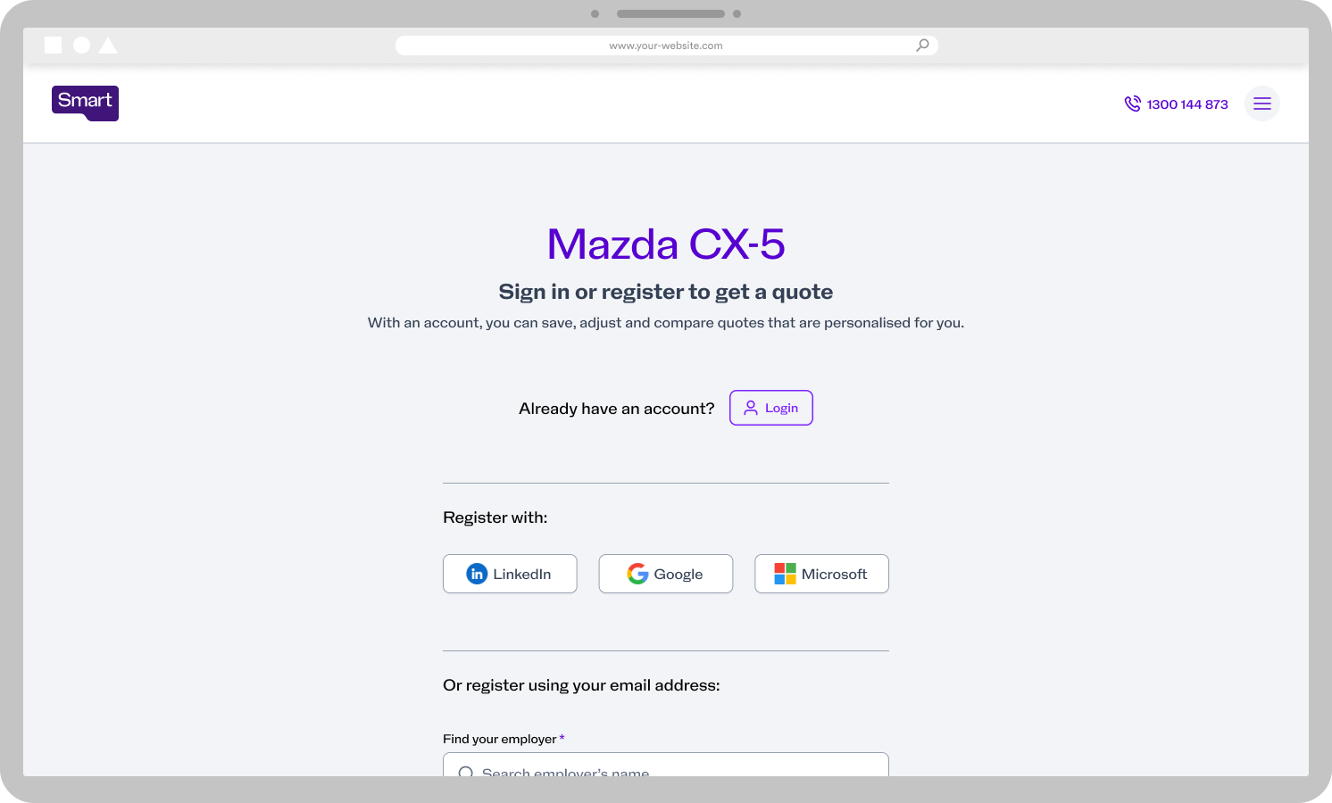
Understand and design solutions for the new journeys from the newly created (combined) website, into the novated leasing product (Novated Leasing Hub) and cater for those customers, their motives and the business’ requirements.
Background
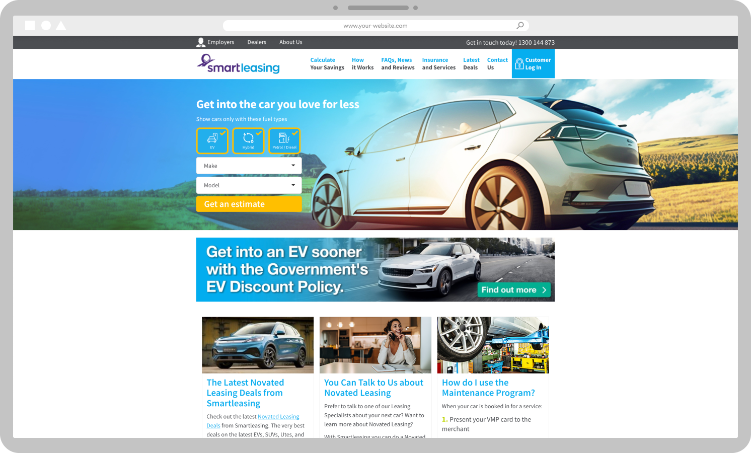
Previously Smart Group’s novated leasing product sat under the brand, Smartleasing. It had its own website, branding and marketing. To get a novated lease through Smartleasing was nearly entirely a manual process. The Novated Leasing Hub was introduced as an MVP just months prior to my joining Smart Group. As an MVP it catered mainly for 1 customer journey and was under the pump of an very unrealistic timeline so quality wasn’t the main focus.
Job to be done
When
I’m using the new Smart.com.au website and I have an interest in getting a novated lease
I want
to be able to easily navigate to the Novated Leasing Hub (the product) to explore my options and understand the financial impact of getting a novated lease for various vehicles.
So that
I can make a decisions that suits my needs.
Key objectives
- Identify and design for new journeys
- Understand and cater for customers’ motivations, and different stages of the decision making journey
- Design a UX strategy to meet all objectives
- Capture leads at the point of quoting
- Design navigation within the NL Hub itself allowing ease for customers to move between our different acquisition tools
- Replace the Smartleasing menu, which will be decommissioned
- Offer navigation options back to the new website, where appropriate
- Simplify unnecessary ‘visual noise’ which may distract the customer from the task at hand
Outcome
As it has just launched there’s much more to learn. But so far we’ve already seen a and major uptake and use of newly introduced navigation features, which cater for various user journey’s and motivations. Part of the strategy is to monitor various navigation points, learn, CRO test if applicable then enhance.
102
Increase in credit applications — demonstrating that users were far more willing and able to initiate the financing process.
127
Increase in lead generation rate — reflecting stronger CTA clarity, reduced friction or improved trust signals.
86
Increase in quote conversion rate — indicating users find it easier to navigate and request quotes.
140
Settlements growth — Showing increased conversion.
Key UX Metrics
Settlements increased 2.4× (from 347 to 834) within the first 9 months post-launch — suggesting users are progressing through the entire sales process more effectively.
Open opportunities exploded from 50 to 2396, indicating:
- Surge in user interest and engagement post-launch.
- Stronger engagement with the platform.
- Possibly higher visibility or improved quote/lead flows.
- Potential need to optimize CRM/sales follow-through to capitalize on these opportunities.
4692
Increase in open opportunities
Journeys
Homepage before and after
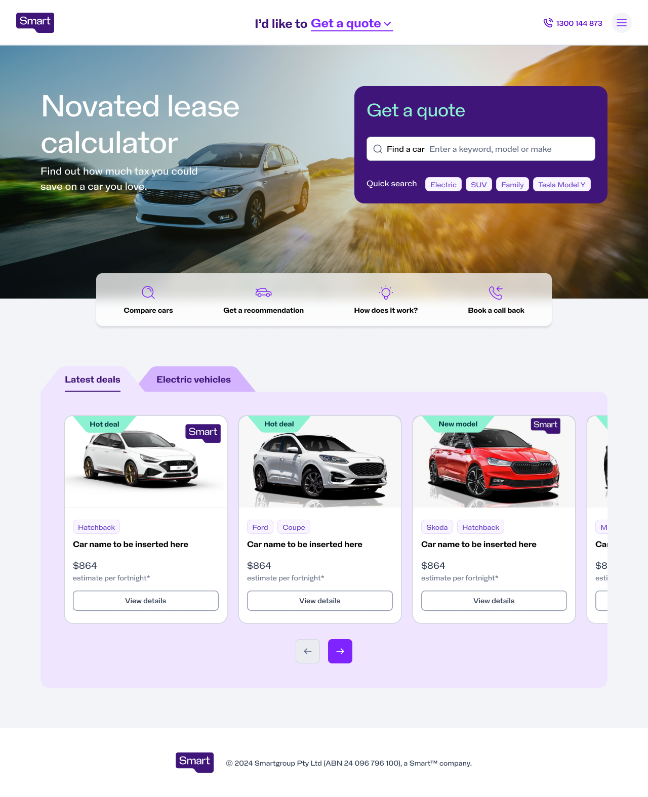
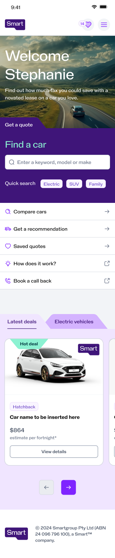
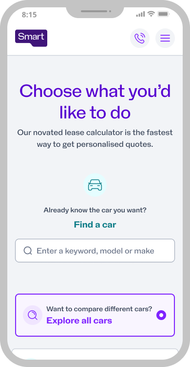
Wayfinding page
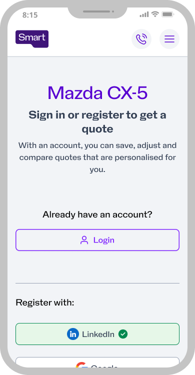
Registration / login page
Dynamic menu